ezo commerce Branding Project
Client
ezo commerce / Ayako Redon
ezo commerce is an EC site selling goods made in Hokkaido, Japan. The brand identifies itself to be an ambassador who bridges Hokkaido and the world. It considers itself a pioneer with an aim to deliver "the true Hokkaido" door to door.
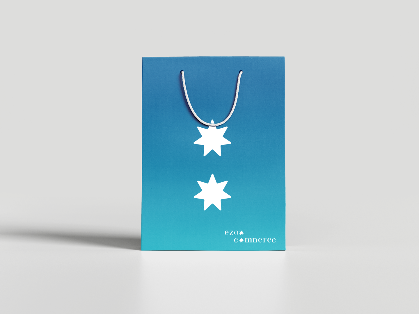
The logo motifs the iconic symbol of Hokkaidoー"Seven-pointed stars" as a tribute to its pioneer era and sprits.
The brand visual communication leverage the iconic landscapes of Hokkaido. The ocean, fields of rapeseed, fields of lavender, and snow scenery inspired the design. Since ezo commerce is an EC business, the mailer box is its most tangible media. The graphic design simply includes two horizontal blocks of colors as the motifs of those iconic landscapes as if "Hokkaido" is brought in front of the customers directly.