Tokyo International Academy Logo Renewal
Client
東京国際文化学院
Tokyo International Academy
Brief
Tokyo International Academy is a private college located in Tokyo, Japan, of which feature is exclusively for Chinese student who come to Japan to learn Japanese.
The client requests to renew their previous logo which doesn’t reflect the feature of the college and being out-of-date. Therefore, a modern, Japanese-look logo is required.
Insight & Solution
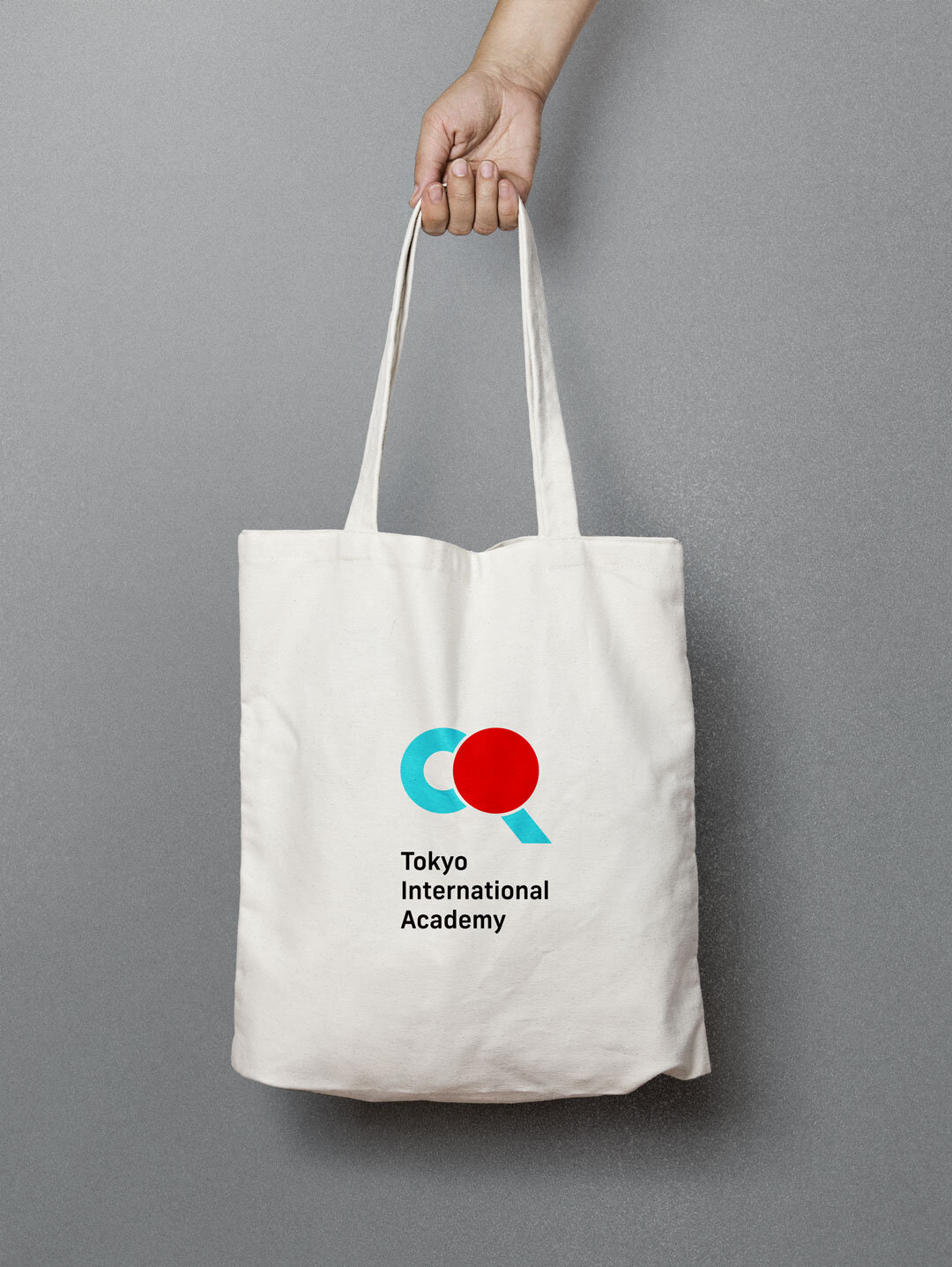
“Mitsuhiki" (水引) is an ancient Japanese art form that uses a special decorative cord at Japanese occasions such as cerebrations like weddings, births and funerals. This “Mitsuhiki” was requested to be the main element to represent the spirit of the college.
To communicate its tradition and welcoming Chinese students, the logo is designed with two coloursー”Red” and “Blue” to represent “Japan” and “China” respectively. Since “Mitsuhiki” is normally knotted by several cords which is not ideal for the purpose to create a modern-look, multiple usages logo. To give a better recongization with optimal visibility, “Mitsuhiki” was simplfied to one cord while keeping the essense of knotting.